New style for the category view
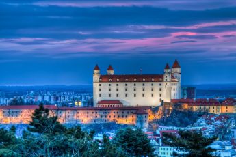
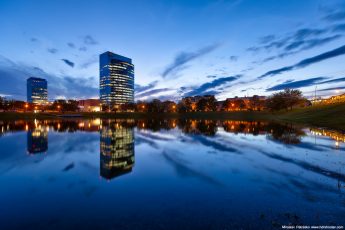
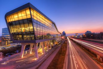
So I finally updated all posts to include a featured image. I needed this, so the categories could be viewed as a nice thumbnail view. I think it’s much better to navigate between posts. You can choose any country or city in the sidebar to see photos taken at that location. Also the before/after category now give this nice overview of all posts that include the comparison.
Soft blue colors on the Apollo bridge
I think I’m starting to be too critical of myself. I finished this photo and already had it uploaded, when I notices a whiter area around the bridge. Probably because I added a little glow. First I tried to edit it out, but could not get the result I wanted, so I started once more. And with the second try, I’m satisfied :)
Also I’m very happy that I started to use a bubble level on my camera. I have the horizon nice and leveled, even if there are distortion in my photo. It really make it easier.
Number of exposures: 7; Camera Model: Canon EOS 5D Mark II; Lens: Canon 16-35 mm F2.8;
Focal length: 20 mm; Aperture: 4.0; Middle exposure time: 6.0s; ISO: 100; Tripod used: yes
Where was this photo taken:
[map z=”18″ hidecontrols=”true” marker=”yes” w=”980″ h=”150″ maptype=”SATELLITE” lat=”48.136029″ lon=”17.127474″]


Outstanding capture and rendering, Miroslav. I love the angle of view and detail of the bridge superstructure. Color tones are perfect.