I don’t know why, but always when I order stuff, it all comes on the same day. It’s never like every day something, it’s all the same day :) But it’s always fun to get some new toys to play with, isn’t it :)

So today my new tripod and ball head arrived, with few more smaller things I needed to go with it. Since I’m switching from a Manfrotto attachment to a more traditional Arca Swiss attachment, I also had to get few extra plates and more :)

Sunwayfoto
Sunwayfoto

I plan to add reviews of everything over time (I need to try it out in work conditions first), but for now, here are some of the photo from the unboxing, and also an unboxing video. Some people tend to find unboxing videos worthless, but I disagree. Sometime it’s very hard to find out what everything is in the package, and a good unboxing video is a great help there. Like here, I needed a second quick release plate, and I could not find anywhere if there is one bundled with the ball head or isn’t.

Sunwayfoto
Sunwayfoto

This pile will be a nice replacement for my already very old Manfrotto 190XproB with the 496rc2 Compact Ball Head, which I used for the last 6-7 year. It still works nicely, only has to be tightened quite often, and has quite a few scrapes all over it :) So what all I got now? The new tripod is the Gitzo GT2542 4 section carbon tripod, from the Mountaineer series. To go with it, I got the Sunwayfoto XB-44 ball head with a replacemetn Sunwayfoto DLC-50 Knob/Lever Combo Clamp, a DPG-39 Universal Quick-Release Plate, DPL-01 Universal L-type Quick-Release Plate and the DMP-200L Multi-Purpose Rail Nodal Slide, all from Sunwayphoto. I hope I haven’t forgot anything while ordering it :)

So await reviews of all of this (together with the Sony a7R and the Metabones adapter) in the next weeks.

When one takes and edits photos, one has to look at them from many different sides. Even it its the use of HDR, composition, sharpness, color, and much more. But a lot of times, one forgets to take into account, the human brain. The think I have in mind, is, that the human brain works in relatives, not absolutes.

This is simple. You never looks at anything on it’s own. Your brain always compares it with something else. A simple example would be money. If you have to spend 10 more on something that costs 1000, you perceive it as a small amount. If it’s 10 on something that casts 50, it looks quite a lot. But if you think about it, the 10 is same in both instances.

Another typical, more visual example is this. Look at this image, and think about which square looks white? Of course it’s the second one.

But let’s add another square next to them. Which one looks white now? The third one. How can this be, when the first two haven’t changed? Simply. You brain compares the square with the ones next to it, and when it finds something brighter, it declares that to be white.


(it’s not so visible if you look at both images at once, as the brain takes both into account :))

So how this applies to photo? Creating contrast between two areas, will exaggerate what you want to show. Let’s look at few situations:

Photo & Video Sharing by SmugMug1. More sharpness – Just think about, when does something looks sharp? When there is something less sharp next to it. You can see this especially in photos with bokeh background. Just by having the background blurred, makes the the foreground pop up more, makes it look much sharper. If you make everything sharp, this contrast effect get’s lost, and everything looks less sharp.

You don’t even have to go the way of a blurred background. Just having parts of the photo sharpened a little less, is enough. Or even just having less detail. Your brain will see the difference.

2. More color – Same as with sharpness, you can make something look more colorful without adding saturation. If you lover the saturation of the surrounding area, it will just look colorful on its own. This is actually also the reason, why sometimes part of a photo may look over-saturated when they are not. You just compare them with other parts of the photo, and it may seem that way.

3. More brightness – This is why most pages view photos on a black background. The photos just look brighter compared with it and more vibrant. But you can see the same effect directly int he photos, where parts may look bright even if they aren’t.

And I could continue like this. The main point is, that if you want make something more dominant, try having it next to something that’s completely opposite to it :)

Today I will show you a program I like to use when I quickly need to compress my photos. I don’t use it for the photos I post daily, as those are compressed very little, but I use it all the time for the blog parts, like the slide-show, or thumbnails, or when I need to send a lot of previews at once.

So here is the program I use. It’s called Caesium Image Compressor. It’s a free program, that even includes a portable version, so you don’t even have to install it. It can be downloaded from Caesium’s site here.

The interface gives you a lot of buttons, but I actually use only three things. I set the quality in the bottom left, choose same folder as input in the bottom right and hit compress. It will automatically add _compressed to the new file name, so this makes it were quick to work with.

Caesium

And here are two comparisons of the results (view full size by clicking on them). Both are compressed from a 100% jpg to a 80% quality in Caesium. You can see the respective file sizes under them.

Caesium1.36 MB
Caesium284 KB
Caesium1.12 MB
Caesium239 KB

Btw. to get the same file size when using the Photoshop save for web dialog, I had to lower the quality to 45-50%.

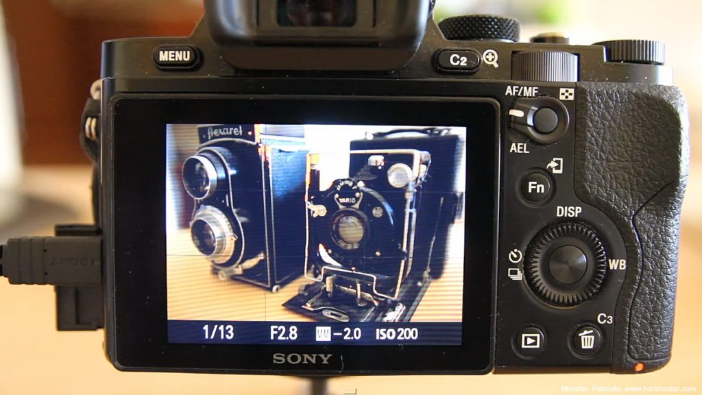
camera-bracketsToday, I will show you how to take multiple brackets for HDR using the in camera auto exposure of the Sony a7R, and also how to do it manually, by changing the shutter speed on the camera.

The a7R is a little limited with the automatic exposure bracketing. You can do only 3 or 5 images, and the 5 can only be spaced by 0.7EV. Additionally, you can’t do all of them with one shutter button press, and you can’t go over 30 second for the longest exposure.

Having a remote while doing this is a real help. Even if you are using the in camera exposure bracketing, you either have to hold the shutter button pressed, or trigger each time separately. Doing this with a remote will result in no camera shaking. If you don’t have a remote, use the 2 second delay, so the camera stabilizes a little after you pressed the shutter button.

For more exposures, you need to go with manual bracketing (or some other off camera solution, I will go through those at some other time :)). Again, it’s better with a remote, but can be done also without. The steps you need to do is:

1. set the camera to manual
2. choose your ISO and aperture
3. set up the shutter speed, so you get the darkest exposure you want ( the camera show only until -2EV, but just split the time in half, and you have -3EV, split again for -4EV ans so on)
4. take the shot (either remote or self timer)
5. double the exposure time (turn the exposure time wheel 3-times)
6. repeat steps 4 and 5 until you have all the exposures you want

A little note to this, the Sony continually meters the scene, and it can show you a different exposure bias as you set. For instance, you can be at 0EV and double the time and the camera only show +0.3EV. You can just ignore that, and just focus on the time. Double the time, change the exposure by 1EV, regardless of what the camera show.

Additional, if you hit on the 30 second limit. For instance, your +1EV is 20 seconds, and you want a +2EV, you would need a 40 second exposure for that. You have two options here. Either switch to the bulb mode, and just use a remote to hold down the shutter button for the 40 seconds, or a much easier way, is to just double the ISO. Doubling the ISO has the same effect as doubling the exposure time, you will brighten the shot by 1EV.

And since the easiest way to show something like this is in a video, here is a video of that :)

I hope it understandable for you, and if you have any questions about it, feel free to ask :)

If you ever created a HDR image, you probably seen this problem in your photos. It’s actually also the biggest thing I don’t like about Oloneo Photoengine. But there is a simple solution :)

What I am talking about, is a visible border around the areas, where the dark and bright parts of the images are merged. There is a small darker border around the dark area, and small brighter border around the bright area. Usually this is around the horizon, where the sky ends. This may be not so visible, but once you resize and sharpen, this may become very noticeable. Here you can see how it looks, and how we will correct this in this guide.

Bright outlines

Not everyone is bothered by this, but I am :) I like when my photos look good also when seen big. So today, I will show you how to easily get rid of this problem in few minutes.

The first thing that comes to mind, how to remove this, is just to use the Clone Stamp tool, and just carefully go around the borders, and paint them over. This works, but it’s very hard to do quickly and without errors. To make this much easier, we will use the blending modes that Photoshop allows for. This works for most cases, there just needs to be a brightness difference between the areas (if you sky is darker than the ground, this will not work that great).

1. Find the area that needs to be corrected (I will explain it on this example). Choose the Clone Stamp tool, choose a soft brush, 100% opacity and Darken blend mode. Now Alt+Click on a close part of the sky to choose the source, and start painting over the bright border. You will notice, that the bright part is painted over, but nothing else. Keep doing this, and also changing the source point, until you paint over the whole bright line.

Bright outlines

2. Once the bright border is gone, we still need to get rid of the darker border under it. To do this, changes the blending mode to lighten, choose a source spot in the dark area, and start painting over the border again. Now, only the darker border is affected, and you will get rid of it very quickly.

Bright outlines

3. And you end up with a photo without any outlines at all. One note, be carefull when removing the bright part around lights, as the darken mode will also darken them. Either use a smaller brush, and go slowly around it, or add a mask to your finished edit, and mask out the area of the light.

Bright outlines

And for those lazy to read through this post (or who didn’t understood the technique completely :)) you can watch the process also in this short video I made.

Feel free to ask any questions, if something is hard to understand :)

FREE EBOOK!!!
Subscribe to my newsletter and get a free Capturing fireworks ebook. 
Subscribe