Since I posted so many fireworks photos this last few weeks, I chosen one also for todays process post, to show you how it was edited. So this is of course one of the photo from the New Years fireworks. So here goes.

Red DanubeFinished photo
Red DanubeOriginal photo

This was of course an edit from a single RAW file. I started in Lightroom, where I first removed the perspective distortion, toned down the highlights and removed chromatic aberrations. From there I exported two version, one normal and one underexposed by one stop.

Red Danube1st export
Red Danube2nd export

I loaded the first export into Oloneo Photoengine, where by changing the strength and contrast, I created a base for my further edits. Then I loaded it, and the two Lightroom exports into Photoshop. There I did the following edits (layers numbered from bottom up).
1. Oloneo Photoengine result.
2. The brighter Lightroom export, to brighten the ship and the corners.
3. Darker Lightroom export to darken the center explosion.
4. Merged layer on which I removed dust spots and filled in the corners.
5. Color efex tonal contrast to add more contrast to the explosions.
6. Imagenomic noiseware to remove noise form the sky.
7. Added overall contrast.
8. Recovered the shadows a little from the Photoengine result.
9. Selective contrast to few more spots.
10. Small de-saturation of the red color.
11. The colors were still to strong here, so I used a copy of the Photoengine result, set to color and just softly brushed over few spots.
12. Brightened the center a little, as it looked too gray after the edits.

Red DanubeOloneo edit
Red DanubePhotoshop edit

And that’s all I did with this image. To find out more on how I edit, check out the guides and before after categories on this blog, or check out my video tutorial series here:
banner-master

Been a while since I updated the wallpapers page, so I’m doing it today. This time I added three new wallpapers taken all in Zermatt in Switzerland. As always, there are all available in 1920×1200 and 1600×1200, and you can get them from the wallpapers page.

Sunny moment at Matterhorn 1920x1200
Alpine peaks 1920x1200
Through the trees 1920x1200

You all seen the photos where everything looks like it is falling. Perceptive distortion is one of the most common problems in photos and there are multiple ways to remove it. So today I will show you one simple way in Photoshop.

Photo & Video Sharing by SmugMug

How to avoid perspective distortion

But before I start, here is how you can avoid it. Perspective distortion appears when your camera is not perfectly leveled. It not only has to be leveled from left to right, but also from front to back. If you have this, your photos will have absolutely no perspective distortion in them.
Some of the newer cameras have a leveling function directly in them, and you just have to turn it on so you see if your camera is leveled correctly. If you don’t have this function, get yourself a 3-axis bubble level for the flash hot-shoe and use that.

Correcting perspective distortion in Photoshop

Let’s look at one of my recent photos. This is from the New years fireworks. I wanted to catch the whole explosion, but as I was standing quite close I could not have the camera leveled and still get it. So I ended up with this distorted image. So the steps to correct this were:

1. Loaded image into Photoshop
2. Unlocked the background layer, so I can edit it. Just double click on the layer, and in the pop-up choose OK. You can also create a duplicate layer instead.

Correcting perspective distortion1. starting photo
Correcting perspective distortion2. unlock layer

3. Hit Ctrl+T to enter Free transform. When the selection appears, right click inside it and choose Perspective.
4. Now to correct the distortion, you have to drag one of the top corners to the side, until the vertical lines are at 90 degree angle to the horizon.

Correcting perspective distortion3. enter free transform
Correcting perspective distortion4. change perspective

5. You can see that with this correction, everything looks a bit squished and strange. So this still has to be corrected. So right click again inside the selection and choose Scale.
6. Now we can again scale the image, so by dragging the top center point we can stretch the image up, until it looks good. On some images this can be also the bottom, depends on the content you don’t mind cropping off. Here I cropped of from the sky.

Correcting perspective distortion5. change back to scale
Correcting perspective distortion6. scale image

7. Once you are done, just hit enter, and you have a corrected image.

This works fine with images with a little distortion, but if you have much more, it will just not look good corrected. It’s just look too stretched afterwards. So think before you take a photo, that you have no or only a little distortion to correct.

Few days ago I posted a photo where I created a reflection of a cityscape, and I thought I would show you how one creates one of those (or better said how I do it). I like to keep it simple, and not overdo it. Especially in the scene I used it, night cityscapes, putting too much detail and distortion in the reflection, makes it looking more fake than real.

So I presume that you know at least a little on how to work in Photoshop, and I will do this whole thing in fewer steps, not going the long way around. So lets start (the step number will correspond to the screen-shots in the same order).

1. So let’s start with nice night cityscape, that is perfect for this. You can get the photo from here, if you want to follow along with the steps.
2. Fist step, is to expand the photo so it can accommodate the reflection. To do this, choose the crop tool, and then move your cursor over the small marking in the bottom center of the crop overlay. Your cursor should change into a double-sided arrow. Once there, start dragging the point down, until the center of the crop overlay is on the same line as the horizontal line. Let go, and confirm by pressing Enter.

Creating a cityscape reflection1. starting photo
Creating a cityscape reflection2. expand canvas

3. Now we have to copy the cityscape. Choose the Marque tool, and select the part of the photo from top to the horizontal line. Then, while still having the Marque tool selected, right click anywhere inside the selection and from the menu choose layer via copy. This will duplicate this selection into a new layer for you.
4. Select the new layer now and press Ctrl+T (or Edit/Free Transform if you like the slower way of doing things :)). Right click inside the selected area and choose Flip vertical from the context menu. Hit Enter to confirm.

Creating a cityscape reflection3. create copy
Creating a cityscape reflection4. flip copy

5. Now choose the move tool, hold down shift (so you move in a straight line) and drag the flipped copy down, until you get it to the bottom border of the image. This will finish the basic reflection.
6. Now to add a little bit of movement into the reflection. As I said before, I don’t like adding too much, just a little blur and motion. So go under Filter/Blur/Motion blur and choose 0 for Angle, and 10-30 pixels for the Distance (around 10 pixels for every 1000 of the photo width). You may need to experiment a little to see what works best for your photo. Click on OK to confirm.

Creating a cityscape reflection5. move copy
Creating a cityscape reflection6. create blur

7. To make it a little more interesting, let’s add few small waves to it. To do so, lets first crate a new layer (the second button in the bottom right), fill it with white (simplest way, is to press Shift+Backspace and chose White in the Use selection). Then add noise to this layer, by choosing Filter/Noise/Add Noise. Use 400%, Gaussian and Monochrome.
8. Now lets add some motion blur to this layers. Go under Filter/Blur/Motion blur and choose angle 0 and Distance of about 4 times the one you used before (around 40 in my case)

Creating a cityscape reflection7. new layer with noise
Creating a cityscape reflection8. add blur

9. We have to add more contrast to this layer, so only some of the waves are visible. To do so, go under Image/Adjustments/Levels (Ctrl+L for short) and in the levels dialog, push the three sliders around, until you have something similar to my result. All should be close to each other, around the 3/4th of the scale. Confirm this adjustment.
10. Still to make the waves a little better, let’s make the ones closer a little bigger. To do so, with the waves layers selected, press Ctrl+T to go into Free transform again, right click on the selection and choose Perspective. Then grab the bottom right corner of the selection and drag it to the right. This will affect both corners and you get a result as on the screen-shot. Once done, confirm with Enter.

Creating a cityscape reflection9. add contrast
Creating a cityscape reflection10. perspective distortion

11. Now to finish, we need the waves to be only on the bottom part of the image. The simples way is to create a clipping mask. To do so, with the waves layer selected, go under Layer/Create clipping mask. The layer will now have the same size as the one under it. Now just change the blending mode to Soft light and the opacity to something around 5-10%, and your done.

And for those who want to see this as video, here it is :)

Feel free to ask if something is not explained enough in this tutorial, and I hope you like it :)

And we arrived at another Monday, and you know what that means :) Another process post. For today I chosen this manually blended night photo from Dubai, so let’s get to it.

Moon and neon lightsFinished photo
Moon and neon lights0EV exposure

As you can see, the most edits were to correct the color and brightness of the photo. There were also few changing lights, that I wanted to capture in the shot. I took 7 exposures here, just to be sure. I did not know how dark I have to go to get a good looking moon in the photo, and in the end I haven’t used them all anyway.

Moon and neon lightsAll exposures
Moon and neon lightsLightroom tweaks

I started in Lightroom. As I wanted to do very few edits, as I wanted to avoid color banding as much as possible, I did quite a few edits already in Lightroom. I opened the shadows, darkened the highlights, added contrast and exposure. I also corrected the horizon line and changed the white balance. From there I loaded the exposures into Photoshop and continued from there (layers numbered from bottom up)

1. -1EV exposure, from which I started
2. Complete sky replaced from the -2EV exposure
3. -3EV from where I darkened few bright lights
4. 0EV to get back some of the highlights
5. Merged copy, as I wanted to retouch out the wheel on the right side
6. Little recovery, of the rotating wheel on the right, as I didn’t like the blended version
7. More contrast to the top part of the image
8. More contrast to the whole image
9. Little more overall saturation
10. And a little bit more contrast once more

Here you can see the screen shot from Photoshop, and you will notice a huge amount of color banding in it. But if you read my post Dealing with color banding few days ago, you know why it is so. Once I merged the layers, the banding disappeared :)

 
And that’s all I did with this image. To find out more on how I edit, check out the guides and before after categories on this blog, or check out my video tutorial series here:
banner-master

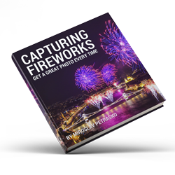
FREE EBOOK!!!
Subscribe to my newsletter and get a free Capturing fireworks ebook. 
Subscribe