Free HDR video tutorial

Free HDR video tutorial

MASTER EXPOSURE BLENDING

Find the best ones

Find the best ones

TOP PHOTOGRAPHY SPOTS

Free wallpapers

Free wallpapers

HIGH-RESOLUTION WALLPAPERS

Instagram

Recently I shared quite few animated photos here, but I shared even more on Instagram. You can head over to my account and check them out.

Close to the water in Lyon

When it comes to reflection, I like to get as close I can to the reflective surface. It just makes for a more interesting view. Same here, in Lyon, where I got completely close to the surface of water, to get this shots.

This is a blend of two exposures, edited in Lightroom and Photoshop.

Today I’m going to show you how Plotagraph Pro works and what are the steps needed to create an animated photo in this software. So let’s get started.

Choose your photo and load it

So the first step is to choose your photo and load it into Plotagraph pro. You can choose any photo, the only limitation is that the file size has to be under 20Mb in size. I like to do photos of 4096 pixels across, as then I can export the result as a 4k MP4 file.

Ploatagraph pro how to

Mask your photo

The second step, is to mask out the areas you don’t want to animate. The easies is to start with automated mask tools. Here you choose either Area to Mask or Area to Animate and draw a red (green) line to define the area. Plotagraph Pro will then try to mask the photo based on your selection.

Ploatagraph pro how to

It does a quite nice job, but mostly you will still need to go in, use the mask brush and correct the edges of the selection. I did the same here.

Hide the mask

This is an optional step. You can choose layers and hide the mask and the quick selection. You just don’t need to see them once you done with the masking.
Ploatagraph pro how to

Feather the selection

The next step is to feather the selection. There are two feathers here, the background and the foreground. For the background, the stronger you choose, the further away from the mask is the area from where the program tries to pull from, fill in the mask. This is needed if you try to animate around object, like the roofs and towers here.

Ploatagraph pro how to

The other feather, is the foreground. The stronger you choose here, the softer the transition will be between the masked area and the background. I would not go too high here, as especially with object with hard edge, this will remove all of the edge sharpness and things looks a bit washed out.

Add animation points

Now you can start adding animation points. One can add them and directly drag them to where you want the animation to go, but I prefer a different method. First I turn off the click-and-drag, so I cant directly drag the photos. Then I start adding them to the areas I want to animate. Here I want to animate the water and I want to animate the clouds. So in the water, I will create one line from the points. In the sky, I create multiple lines, as I want to animate the clouds in different speeds.

Ploatagraph pro how to

You can add more points later, but it good to have a good start, to see a good preview of the animation.

Drag the animation points

Now you can choose the selection tool, choose groups of points and then together drag them to where they should animate. Like this the points in the groups will have the same animations. Here I had one group for the water, and few different groups for the sky.
Ploatagraph pro how to

If I tried to animate this right afterwards, I would get a result like this.


(if you are on mobile or use a very old version of a browser, you may not see the animation)
You can easily see that while the overall animation is already there, there are quite a few problems.

Add anchor points

So you see the problems. The animation is pulling in parts of the buildings, even if they are masked out.Here where the animation points come again. If you put a point down and don’t drag on it to make an animation, it will stay as an anchor point. That means that the area under it will not move at all.

You can have Ploatagraph Pro try and create these for you, just by dragging the generate slider. It will add points to areas it thinks are the borders, but you will probably still have to go around the photo, and add even more points right on the borders.

This changed a bit in latest updates. Now you have a separate selection in the menu under Animations points, called Stabilizer/Anchor Points. You still can do it as before, by creating and Animation point and not dragging it, but you can just use a Anchor point instead.

Ploatagraph pro how to

From here you just need to correct all the remaining problems. Play the animation and if you see some, go back into the photo, add more anker points to the area or mask it out. It sometime take a bit of trial and error to get it right. Also, if the problems are close to the corners, adding points outside the area of the photo can help. As the animation can extent also there, having a defined movement outside can give you a better result.

And for this photo, after few more tweaks, few more points and a bit of masking, I got to this result.


(if you are on mobile or use a very old version of a browser, you may not see the animation).

Contrast in videos

Lucerne waves in Plotagraphy ProI noticed that when I share plotagraphs as mp4 videos, they look differently depending on where I play them.

For instance, on Instagram or in Opera browser, they have much more contrast, while in my media player or in Edge, they look as they should. I tried to look if one can embed the color profile as in images, but no luck finding a way. Any of you maybe know one? For now I started to lower the contrast a little in the source images, directly in Plotagraph Pro, but thats not really a great solution.

The Lucerne waves in a plotagraph

I just love how the motion in the waves worked out. It just a perfect spot for adding movement into the photos. What do you think?

(if you are on a mobile or use an old browser, you may only see a static image)

behind the camera in PragueWow this was such a huge amount of birds. I have been in Prague many times, but never seen so many of them there at once. In one moment, it looked like the completely covered the Vltava river, from side to side. And since there were many people feeding them in this areas, they concentrated really close to where I stood.

It was quite a spectacle, just too bad the weather was not a bit better, more fit for photography.

The bird invasion in Prague

For this photo I had to decide to either go with a quick exposure at hight ISO, to freeze the motion, or with a slow shutter speed and blur it. Of course I did both and got few shots in both setups. When going throught the photos afterwards, this is one I liked the most. It has a nice balance. The movement is there, but its not as much so one doest not see the birds anymore. It’s just enought.

This is a single exposure, edited in Lightroom and Photoshop.
The bird invasion in Prague, Czech republic

VFFOTO

VFFOTO is a smaller manufacturer of photo filters, based in the Czech republic. They mostly specialize on circular filters, but offer also some square ones. They kindly provided me with two filters from their range for a test. The GS ND 1000, which is a 10 stop ND filter, and the GS ND 2000 which is a 11 (!) stop ND filter. Both circular, in the 77mm size.

You can see their products on their official Czech site www.vffoto.com.

VFFOTO filters
VFFOTO filters

I tried both on the Canon 24-70mm F2.8 lens with the Canon 5D mark IV. I also took the same shots with the Formatt Hittech firecrest 10 stop ND filter, for comparison.
VFFOTO filters

VFFOTO GS ND 1000

So let’s first start with the GS ND 1000 filter. This is a 10 stop circular filter. The build quality looks great and it has a very thin profile, to avoid vignetting. Here you can see how it performed compared to the Formatt Hitech firecrest square filter. All photos have the same ISO, aperture and white balance. The only change is the exposure time. The first one, without any filter has an exposure time of 1/30 of a second. The filtered ones are both at 15 seconds.

Here is the first series of photos:

No filter photoNo filter
Formatt Hitech photoFormatt Hitech
VFFOTO filters photoVFFOTO ND1000

And here a second one, focusing more on the water.

No filter photoNo filter
Formatt Hitech photoFormatt Hitech
VFFOTO filtersVFFOTO ND1000

As you can clearly see, there is quite the difference. Where the Formatt Hitech pushes the color quite a lot towards blue/green, the VFFOTO has a much smaller effect and the final color is more towards yellow/purple. The VFFOTO is also much more closer to the no filter exposures. On the other hand, the VFFOTO filter introduces more vignetting, but I presume that is due to the difference in filter types (square filter is bigger, therefore less vignetting).

When looking at sharpness and chromatic aberrations, I can’t really say I seen any difference between the no filter shots and the ones taken through the filters. It looks about the same in all of them.

Overall I think the result from the VFFOTO filter is quite good. It needs a bit of tweaking, as with all ND filters, but it’s quite close to how it should be.

VFFOTO GS ND 2000

This is a more unusual filter. Most companies darkest ND filter is a 10 stop, not a 11 stop one. One tends to stack the filters to get them as dark as this one. As I did not have a second one, I had no filter to compare it with. So what I did, I took the exact same shots as with the 10 stop filters, but of course with double the time. Here you can see both of them, both taken with a 30 second exposure. The results came out very similar to the 10 stop ones.

VFFOTO filters
VFFOTO filters

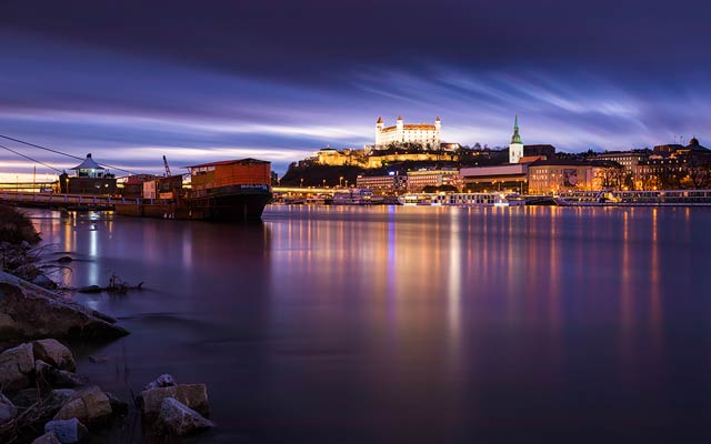
The color cast, sharpness and chromatic aberrations look all the same as with the 10 stop VFFOTO GS ND1000 filter. It is really impressive how much you can stretch the time with a filter like this. From 1/30th of a second, to full 30 seconds, without the need to change any other settings. It makes for some buttery smooth photos. And to show you that, I tried one at full 4 minutes. To be exact, I did it twice, one at ISO 100 and one at ISO 400 to get a +2 EV exposure. And here you can see the final blend. It was not a very colorful evening, but it does show how nice and smooth everything is.

VFFOTO filters, long exposure, Bratislava, Slovakia

Overall, both filters create some very nice results, and I can’t wait to use the more, once the weather get a bit better.

FREE EBOOK!!!
Subscribe to my newsletter and get a free Capturing fireworks ebook. 
Subscribe