Free HDR video tutorial

Free HDR video tutorial

MASTER EXPOSURE BLENDING

Find the best ones

Find the best ones

TOP PHOTOGRAPHY SPOTS

Free wallpapers

Free wallpapers

HIGH-RESOLUTION WALLPAPERS

Of course this reflection is not real. The sea is just not calm enough there to create it. Still one can imagine how it would maybe look like :) With a little help of Photoshop that is. I actually chosen to do this, because I still have some  photos of the Burj Al Arab, but they were all similar to the ones I already posted. So I thought I do something different with one of them :)

This is a HDR form 4 exposures, created in Oloneo Photoengine, mirrored in Photoshop.
7 star reflection

As winter came and went again (it snowed for a whole evening) I still don’t have any new winter photos. And I so wanted to have a little more snow here. But since there is none, I looked through my old photos to find some. And here is one, taken two years ago, high up in the High Tatras. This was taken from the Lomnicky peak, which is 2634 meters over the sea level.

This is a HDR from 3 exposures, created in Oloneo Photoengine, finished in Photoshop.
Over the clouds

One of the more common problems with landscape photos, is color banding. It’s a very noticeable problem, that can give a photo a very ugly look. But there is actually a quite simple solution to this, to remove it, or at least make it less visible.

What is Color banding?

Each time you have a smooth transition between two colors in a scene, mostly in the blue shades of a sky, it can happen that in a photo of it, you will get these steps where you can see where one color changes into another, instead of a smooth transition.

This is due to a limited number of colors one can save in a photo file. Like this, the nearest available color is used and abrupt changes between shades of the same color are created. So the more colors, the less likely this will happen. If you ever edited a photo in 16bit mode, and then tried to save it as a 8bit file to web, you would find this problem rather often.

Here you have a typical scene for color bending. Even in this corrected version, you still can see a little of it due to the compression.
Very early morning at the Hero's square

How to avoid color banding?

  • Use bigger color space – The more colors available, the less color banding. This is of course not possible if you share to web, as browsers don’t work correctly with 16-bit files.
  • Use smaller compression – The more a photo is compressed, the less colors it uses, the more visible the bending is. Of course if you upload to a service that does it’s own compression (like Facebook), you have very little power over this.
  • Avoid noise reduction – Noise reduction is similar to lower quality, where it averages the colors so more banding is introduced.
  • Avoid edits – The more filters or adjustments you put on a photo, the more you run into a chance to create more banding. Especially edits that add contrast tend to introduce more color banding.
  • Avoid removing lens distortion – Especially in the sky, it can create unwanted color banding.
  • Merge first – This is one Photoshop specific. When you put your adjustments into separate layers and then look at a photo, it may look like there is a huge amount of color banding. But this could be misleading. Before you try and correct it, try merging the layers into one (or create new layer from the merge). You will quickly see, that once all the adjustments are applied, the banding becomes much less dominant, or it disappears completely.

How to correct color banding?

So what to do once the banding is there? The solution is to add more variation to the color transition, so forcing the compress algorithm to use more colors and so creating a nicer transition. To do this, one has to add a little noise to the effected areas.
Dealing with color banding
You can use the basic noise filter in Photoshop. Just go under Filter/Noise/Add noise. The settings you need are not always the same, as it depends a lot on the photo, but mine are usually 0.3%, Gaussian and Monochromatic. You can experiment with the strength, to see if you need more or less. I would suggest adding the noise to a new layer, a merged copy of the whole image, and then just masking in the parts where you need it.

Here is an example of a correction like this, before and after adding noise. Please note that even the screen-shots are influenced by image compression so the effect is not 100% as seen here.

Dealing with color bandingNo noise added
Dealing with color bandingNoise added

If you have any questions or a great different solution how to remove color banding, feel free to share in the comments.

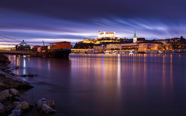
I thought about going out to take some snow shots, but the weather is just crazy recently. In the evening, the snow is there, and it’s gone again in the morning. The next day it snows again, but it dissapers again very quickly. It’s like all 4 season every two day. So until the weather decides what it wants to be, here is one photo from last year, when there was winter at least for few days in a row :)

This is a HDR from 5 exposures, created in Oloneo photoengine, finished in Photoshop.
Little snow by Danube

There are many things one should correct on every photos, and there are some one has to decide for oneself if they need to be corrected or not. And in this post, I will go through them, and give you my thought on what I like to do, and what I think is the best approach.

Chromatic aberration

This one I think that should be always removed. It’s so distracting when you look at a beautiful landscape photo, and then you see this ugly aberration, that just ruins the experience from the photo. And it’s not like it’s hard to remove them. Just one click in Lightroom or Camera Raw. In very rare that you want more chromatic aberrations in a photo, normally only if you are trying to emulate a look of some old camera, but that’s a very special case, as then you are trying to add more mistakes into the photo.
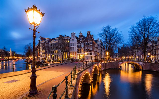
Under  the bridge arch

Dust spots

Another thing that should be corrected always (again not taking into account when you are trying to create a vintage, destroyed photo). Leaving dust spots in a photo just makes you seem so lazy. This should be first thing that gets corrected.

Noise

This one is more for a debate. In some photos noise is acceptable, in some it looks so ugly. And in some you have to leave some in to avoid horrible color bending. I think it’s ok in vintage looking shots, and some portrait photos. I don’t like it in landscape and architecture shots. But it’s all to everyones personal preference.

Crooked horizon

It’s a little simpler with a crooked horizon. If it’s a little crocked, correct it. If it crooked a lot, you can keep it. It just look like intention when it’s crooked a lot, and like mistake when it’s crooked a little :)

Vignetting

If you are creating a panorama, you really have to remove vignetting. You just want to get the best blend possible. When doing a single photo, it’s a personal decision if you want to remove vignetting or not. I usually leave it be, and sometimes even make it stronger. Having the corners darker and center brighter will bring more attention to

Perspective distortion

Perspective distortions can add to the photo, but also make it much worse. You all seen the effect of falling vertical lines when you shoot up or down. It is very different for every photo, if it is acceptable or not. The distortion can give a sense of scale and make seem things are huge. For instance if you look at an interior photo of a cathedral, without a perspective distortion it looks small and strange. But on the other hand, cityscape shots from far look really strange with a visible distortion.
From the monastery

Ghosting

With ghosting, it depends on what kind it is. If you got ghosting because you did a long exposure shot, I think that quite alright. If you got ghosting because you blended multiple exposures, you should definitively correct those, either in the software you blended the exposures, or afterwards in Photoshop.

Saturated colors

I tend to go by a rule, that If I want to have a strongly saturated color in a photo, I only have one. And it also can’t cover the whole photo. The reason is that there having both stronger and weaker saturated colors will add a nice color contrast, and also give the viewers eyes a place to rest. There are saturated colors in the world, so there should also be in your photos. Just de-saturating everything is not a good approach.

White balance

The importance of white balance changes greatly on the type of photography you do. In portrait and studio photography, this is very important. In landscape photography one can play with the white balance more, as also the light varies much more. Just by choosing to go differently with it, you can give a completely different feel to a photo.

FREE EBOOK!!!
Subscribe to my newsletter and get a free Capturing fireworks ebook. 
Subscribe