Free HDR video tutorial

Free HDR video tutorial

MASTER EXPOSURE BLENDING

Find the best ones

Find the best ones

TOP PHOTOGRAPHY SPOTS

Free wallpapers

Free wallpapers

HIGH-RESOLUTION WALLPAPERS

When on looks at photos of mountains, it’s really hard to see how big it is. So including something for reference is always nice. So that’s what I did here. The read was surrounded by this huge hills, and the houses around it just looked so tiny in comparison :)

This is a HDR from 3 exposures, created in Oloneo Photoengine, finished in Photoshop.
Small hut under the huge mountain

I wanted to share with you more 21:9 wallpapers, so today I’m adding three new huge wallpapers. They are again all in 3440x144O, so good for really a lot of screens :) So head over to my Wallpapers page to download them now :)

The fake reflection
Alpine peaks
Above Paris

Some time ago I posted an article with 11 tips for Lightroom, and today, I’m continuing it, with another list of additional 11 tips :)

Remove chromatic aberrations

I would think that this is widely known, but I see so many photos with visible Chromatic aberrations, that I have to mention it. Removing them in Lightroom is so easy, that not doing it, is just lazy. Just going in Develop under Lens Correction and checking the box next to Remove Chromatic Aberration. This will remove them in 95% of cases. In the other cases you also have to go under the Color tab (still under Lens Corrections) and play with the Amount sliders until there are no more visible.

Lightroom tipsWith Chromatic Aberrations
Lightroom tipsCorrected

There is only a very slight downside by using this, the overall sharpness will get a tiny bit lower, but this can be easily corrected and compared to Chromatic Aberrations, this is not visible.

Secondary window

This is one thing I started using more with the new monitor. It’s a great thing if you screen is huge, or you are running a multi screen setup. Just go under Window/Secondary Display/Show (or F11) and a new window will pop up. Here you can choose what you want to see, I prefer the library or the compare view.

Lightroom tips

Full screen view & Lights out

Lightroom has a lot of tool-bars and sometime you just want to see the photo and nothing else. There are two ways to get a better view of the photo. You can either hit F to switch to a full screen view, or even better turn the light off. This is done by pressing L. Doing so, everything except the photo will get much darker, but you can still use all the tool-bars. Pressing L again will circle through three states Normal/Dimmed/Black background.

Lightroom tips

Survey view

Survey view should help you with selecting a photo from a set, but I use it for something else. When working with a HDR series, I like to switch the library view into this view, to quickly get rid of all the photos I’m currently not working on, and only see what I need. It’s also great for my Process post screenshots :) You can get to this view by clicking the button in the bottom left, or by pressing N.

Lightroom tipsNormal library
Lightroom tipsSurvey view

Drag&drop to import

Lightroom is not that Drag&Drop friendly, as you just cant drag a photo from it into a second program. But one thing where this works great is by import. Just select what photos you want to import and Drag&Drop them into the Library view (will not work in any other). The import dialog will open with all the files in that folder, but those you dropped will be already selected and you just need to confirm it.

Rotate images

I don’t really understand the placement of the rotate image buttons in Lightroom. But if you were ever searching for them in the Development mode, search no more. There are none. Your only choice there, is to go under Photo menu and choose either Rotate Left or Rotate Right from there. But if you need to rotate more at once and just overall do it quicker, there are rotate buttons in the Library view. There are quite small and visible only if you hover your mouse cursor over a photos. Also, they will rotate all selected photos at once, so you don’t have to use them one by one.

Lightroom tipsRotate in library
Lightroom tipsRotate in develop

Quickly filter your photos

It’s very easy to quickly filter your photos based on ratings. Just by pressing 0 to 5 on the keyboard you can add a rating to any photos, and then just filter by that. I like to give 5 starts to photos I want to edit, 4 stars to those I already edited and 1 to those I plan to discard. Like this, it’s very easy to find photos to edit, or photos I still have to look at.

Lightroom tips

To filter, just click on Atribute above the Library and choose the rating you want to see.

Use manual lens correction

The buttons under Lens corrections, like Level, Vertical, Full, are very inviting, but I would stay away from them. The Manual tab gives you much more control about the correction, and you can create a much better result. But still, I would avoid doing very strong corrections here. Lightroom will not resize the photo to include the expanded area and you will loose big parts of the photo. In that cases doing this in Photoshop is a much better option.

Lightroom tipsNot corrected
Lightroom tipsCorrected

Avoid Constrain to Warp

This is for when you are editing HDR series, as with single exposure there is no problem. Constrain to Warp automatically crops image, to avoid any empty space due to the distortion corrections. This is quite often great, as it’s easier than cropping yourself, but there are two big drawbacks. Firstly, Lightroom will crop usually much more that it’s necessary and a lot of stuff that is cropped can easily be filled in using Photoshops Content aware fill. Secondly, this crop is not synced properly between photos. So if you use it on one photo from a HDR series, and then sync, you will often end up with photos of a different size and that is not the best start for any HDR tonemapping. If you just crop manually using the crop tool, the problem is not there.

Change the camera calibration

From time to time you will see, that the color in Lightroom just don’t match what you have seen on your camera screen. The reason is simple. Lightroom automatically applies a Adobe Standard profile to all photos, and that can be different to your cameras profile. To correct this, you need to go under Camera Calibration, and choose the profile you used on your camera. The available profiles vary based on what camera you use and if Lightroom supports it.

Lightroom tipsAdobe Standard
Lightroom tipsCamera Neutral

Use the same color space

When one edits in more than one program, it’s best if the color space used is the same in all of them. So if you work for instance like I in Lightroom, Photoshop and Oloneo Photoengine, the best results are if all of them use the same setting. I use the ProPhoto RGB for all my edits (except when saved for web) and so I have it set up in all of the software. To have Lightroom export to Photoshop in this color space, go under Edit/Preferences and under the External Editing tab choose the Color Space for Adobe Photoshop.

Lightroom tipsOpen preferences
Lightroom tipsChange color space

That’s all for this list and feel free to ask if have any questions.

Sale reminder

For those who missed it, you can still get a 40% discount on my video tutorial Master Exposure blending. Just use the code from the banner on top of the sidebar. The sale ends in three days, so if you want it, now is the best time :)

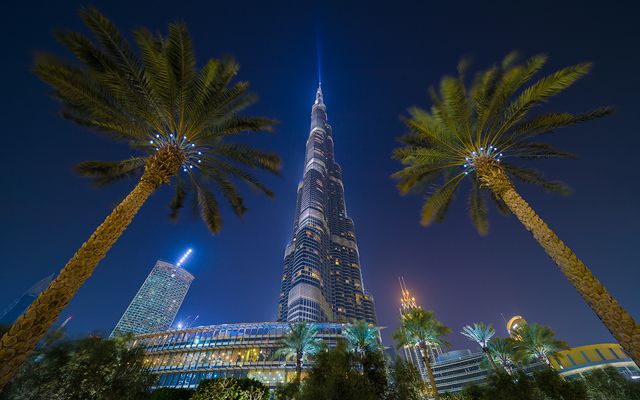
Night reflection

The weather in Bratislava continues to be just ugly. After few days of rain I actually saw the sun for few moments today, but nothing to be crazy about. So I will continue posting photos from earlier this year, that I haven’t edited before. For today, it’s one from Dubai.

This is a HDR from 3 exposures, created in Oloneo Photoengine, finished in Photoshop.

Night reflection

A little later than I planed, but today I have for you a review the 34 inch monitor LG 34UM95. Due to some problem I had to return the first one, and I’m now on a second, but I will get to it soon. So let’s take a look at it.

Size & Resolution

This monitor is just huge. I upgraded from a 24 inch monitor, and the difference is really recognizable. It’s not a 4k monitor, as the resolution of 3440×1440 is only aroud 2.5k. You could look at this as a downside, but I think it’s actually a plus. Due to this resolution, your PC does not have to be crazy strong to be able to run it, and also, the ppi is still low enough, so you don’t have to scale the operating system. Operating systems and programs are just not yet all ready for a high ppi screens, and scaled UI elements just look ugly. On this screen, you can keep the default scaling, and it’s still really usable.

LG 34UM95Panorama on whole screen

Working on it

Working on it is just a pleasure. You have so much space as on two 20 inch screens, without the ugly border in between. After a few days I rearanged my Photoshop to show all I’m using at once and I still can have a panorama photo opened in a nice size. Also if you are editing a lot with Lightroom, creating a nice setup is very easy.

For other work, you can easily have three pages opened next to each other will everything having a proper size. This makes for instance editing my blog much easier, as I can have the page preview, page edit and my portfolio opened all at once and just copy and past from one into another.

LG 34UM95Working with Photoshop
LG 34UM95Working with Lightroom

All this splitting is made easier with a bundled piece of software called Screen Split. In this small utility, you can choose how you want to have the screen split, and all windows you then drag around the screen will automatically snap to the predefined areas. It’s very handy if you tent to use the same (or similar) setup all the time.

Movies

As this is a 21:9 resolution screen, you movie experience differs very much based on a movie you watch. If you watch a movie in this aspect ratio, it’s just a huge pleasure. No black bars, great colors, huge viewing area. Of course if you wantch a movie with the aspect 16:9 or even 4:3, this gets much much worse. You will get huge black bars from the sides and the viewing experience is greatly diminished.

LG 34UM954K trailer 2.35:1 ratio
LG 34UM95Full HD trailer 16:9 ratio

For me this is perfect as I don’t own a TV, and all my movie watching is on my PC. Just not good for watching TV shows full screen.

Games

Similar to movies, you game experience will greatly vary based on one thing. If the game supports a 21:9 aspect ratio resolutions (2560×1080 or 3440×1440) you will get a perfect experience. The wide viewing area is very immerssive and the new look will get you playing games you finished a long time ago. Again, if you play something that is not 21:9 this gets much worse. You can choose either stretched view or the black bars on the sides. Neither of this options is that great.

LG 34UM95Bioshock Infinity
LG 34UM95NFS Most Wanted

To make things a little more complicated, even games that support the required resolution, don’t always have the UI and the menus working correctly. So you get cropped off parts, missing UI and similar. In some cases you can use a program like Flawless Widescreen to correct this, but in my experience that does not work in all cases. Either way, some experimenting and PC knowledge is required.

Problems

There are three problems with this monitor. First is the still very new aspect ratio. Not yet everything supports it, but I believe this will get better over time, as more monitors with this aspect ratio are release.

Secondly the stand is not the best. It’s too low, with the hight not being adjustable. It’s also not that stable, and any stronger shakes to the table will result in the whole screen shaking. Sometimes even just typing on the keyboard a little faster can cause this. Luckily, the monitor includes a VESA mount, so in the worst case one can replace the stand with a different one or a mounting arm.

LG 34UM95Backlit problem on first piece
LG 34UM95Backlit problem on replacement piece

Thirdly, the biggest problem, is a backlit bleed. This was the reason I replaced the first one I got, but the second one has almost the same problem, even if not so visible. Maybe you will be luckier and there will be none, but I haven’t seen one like that. The problem is mostly visible at night and if you are running a content that does not fill the full screen. From my view, it varies. Sometimes I don’t see it at all even with dark content on the screen, sometimes it’s very distracting.

In the end

So after two weeks with the monitor, I decided to keep it, even with the problems. I just can’t go back to a smaller one, this size and aspect ratio are just perfect for me. I found out, that I can see the backlit bleed only about 3-5% of the time I use the monitor, and I can live with it (even if maybe I send it back for a repair some months later) If you are looking for a new monitor, you should definitively have a look at this one or a similar one of the same size (there is only one from AOC currently and that is hard to get by, Samsung and Dell will have some later on, sometime next year). But if you can, be sure to try it before buying or buy from a place where you can return it. Maybe you get lucky to get a one without any problems, but why take the risk :)

You can find more photos and my initial thoughts in this post.. Also if you are curious about the current price of this monitor, here it is on Amazon – LG 34UM95

FREE EBOOK!!!
Subscribe to my newsletter and get a free Capturing fireworks ebook. 
Subscribe